Project duration: February 2022 – May 2023
Deliverable: Application for iOS and Android
My role: UX Designer, UX Researcher, UI Designer, Project Manager
Tools used: Figma, Illustrator, Miro, UsabilityHub, MS Sharepoint, JIRA

This project is part of an UX design course, in which I took part in 2021. I chose to create an expert web application where users can be helped in their search for a therapist.
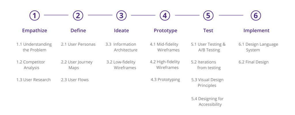
Design Thinking Process
Background
Getting the right therapy can be a trial process that can take years, and mostly we just find out what we need through trial and error. I aimed to create an application where therapy seekers can be helped in their search to find the exact right therapy that they need.
Problem Statement
Therapy seekers need a way to find a suitable therapist that can help them with their exact issue, because they this will dramatically increase the chances to start a successful therapy trajectory from the start.
User Research
I conducted 4 user interviews, of which two licensed psychotherapists to get a better understanding. The other two interviewees were people experienced on the receiving end of therapy. I conducted moderated remote interviews through Skype, which were recorded. 15 people responded to my user survey, which was conducted with Google forms.
Main Takeaways
- Availability is one of the most discouraging aspects of finding a therapist. This is also confirmed from the expert’s side, as they are pretty overwhelmed with people who are seeking therapy.
- A forum will not be successful due to the fact that therapy seekers would rather speak to a knowledgeable expert about their issues.
- Education about therapy is desired. When starting therapy most people don’t know about the possibilities and find out through trial and error, the therapist, or reading online.
Personas + User Journey Maps + User Flows
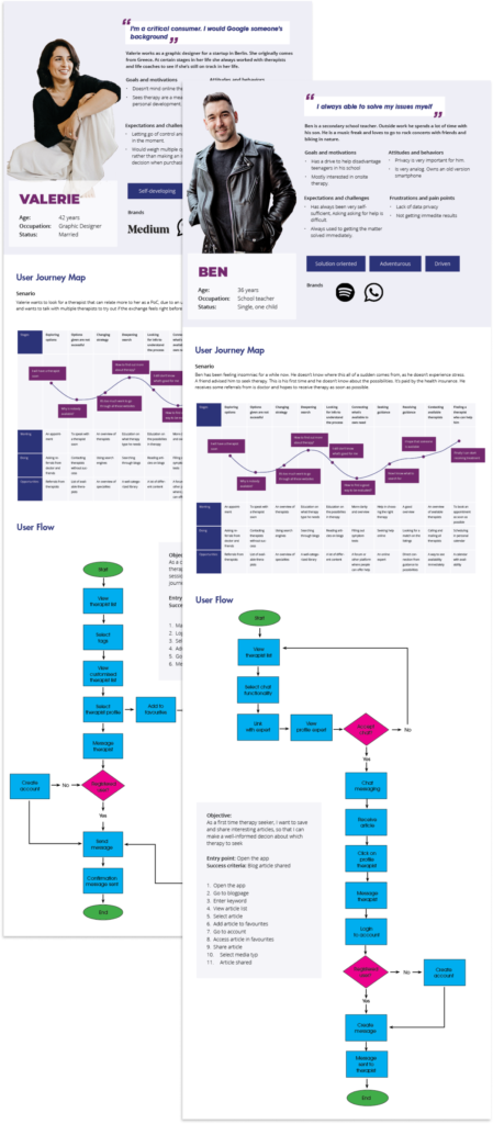
Based on the user research I decided to create two personas: Valerie and Ben. Valerie has been taking therapy for a long time and sees it as a means of self-development. Based on her experience, she knows what type of therapy she wants, and she looks for a therapist with whom she has a good understanding. Ben is a first-time therapy seeker. He is used to having health issues under control and feels a bit overwhelmed by what’s happening and the possibilities in the therapy field.
Regarding the experts, I felt that that there was not interest from the therapists to be involved in an app as this. So, the app has mainly been developed with the therapy seeker in mind. Therefore, I decided to create a persona for the mediator, Stefan. However, I do see possibilities for the therapist as a user of the listing from a technical perspective. So, adding this as another would be an option for future development.
Ben’s user journey consists more about being overwhelmed with the possibilities in therapy and wanting guidance in what he needs. Valerie is more aware of what she needs and she focuses on finding a good match with her therapist.
Valerie’s user flow therefore goes more directly to saving profiles and booking sessions, while Ben’s seeks help from an expert and goes through the content of the blog.
Information Architecture
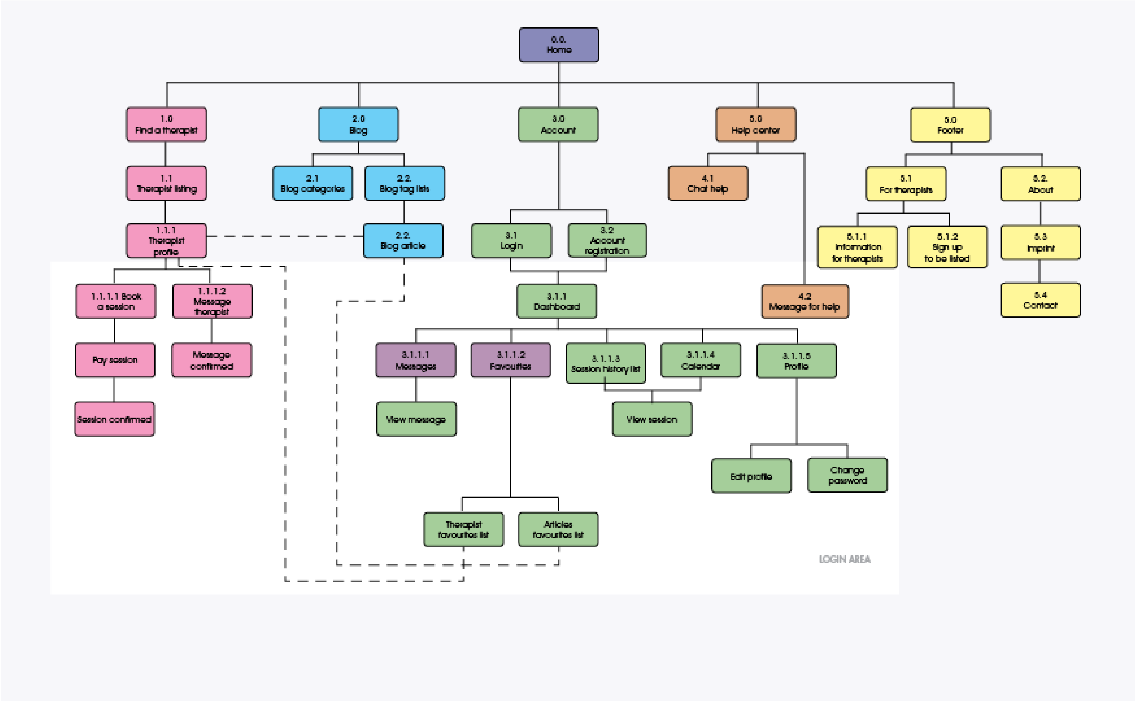
Based on my research and the user flows, I identified three main categories for the therapy expert app: a therapy listing where the user can find a book a session with a therapist, a blog which serves as a main collection for articles, and a help center where the user can receive guidance in their search. To keep the app as open as possible to all users, I decided to keep all three sections open and the personalization happens in the account, with access to messages, the option to book appointments with therapists, and saved articles. The favorites section always stays available at the top of the account.
Low Fidelity Wireframes
Paper sketches are perfect for changing layouts, I experimented with different sorts of paper sketches but eventually I decided for the phone layout with the grid, since this provides more context and visual guidance on proportions. Drawing with pencil is a process were you can easily “undo” concepts that don’t work, which I really liked. For me to get more an idea of the user flows, I spread the paper sketches out on a table. This also gave me a visual understanding of how the pages are connected to each other.
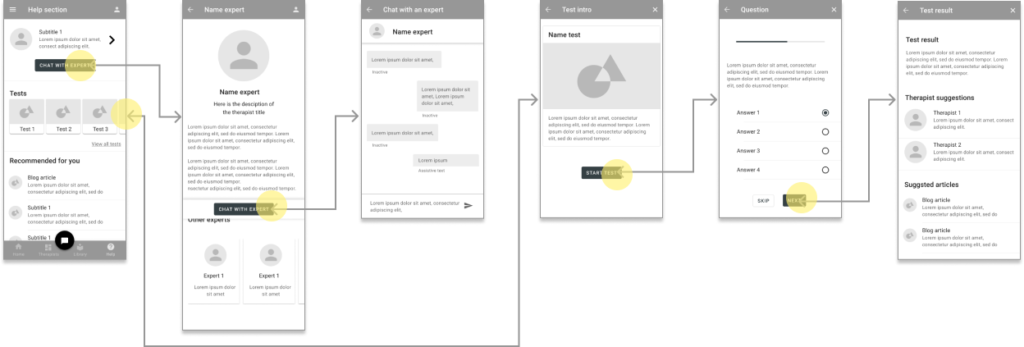
Below is an illustration of the help section, together with the chat function and the test sequence.

Mid Fidelity Wireframes
Eventually the paper wireframes were pretty much translated one-on-one to the mid-fidelity wireframes, with little alteration.
For putting together the mid-fidelity I used the Material Design template and guidelines. This allowed me to work within an pre-existing design framework and focus on the main layout instead of investing time in setting up margins and padding. And later just had to customize the elements. I feel that the use of pre-made design elements already give the user a big sense of recognition.
Below is an illustration of the help section, together with the chat function and the test sequence.
High Fidelity Wireframes
Filling the design with content, really brought the app to live for me. During the design process I already started connecting the frames. Due to the previous setup with Materials Design, I only had to fill the design with content.
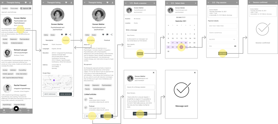
Below is an illustration of the therapy listing, together with the messaging and the booking process.
Prototype
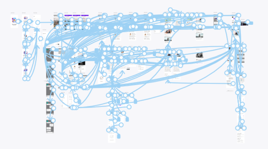
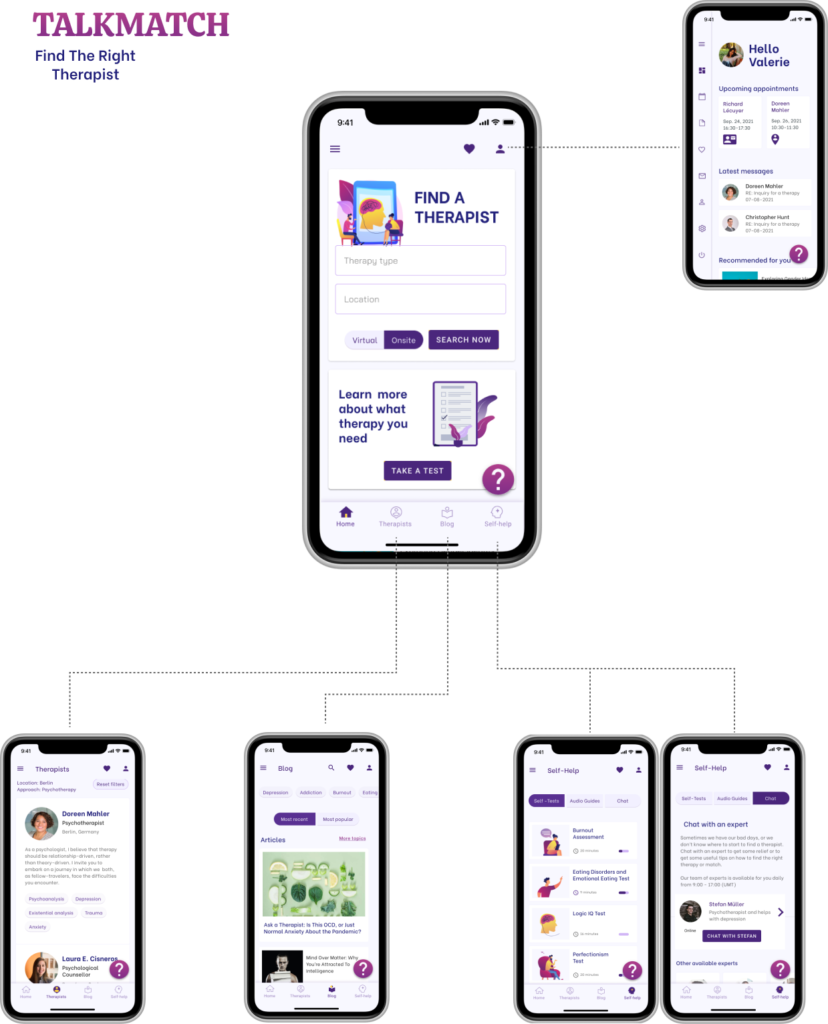
What I like a lot about the prototype is that it adds dynamic to the designs and that the user can interact with it (hopefully) in a way that I envisioned it and which I can test. The map below shows the interlinking of the pages, which is very rich mainly especially due to the navigation bars.
User Testing
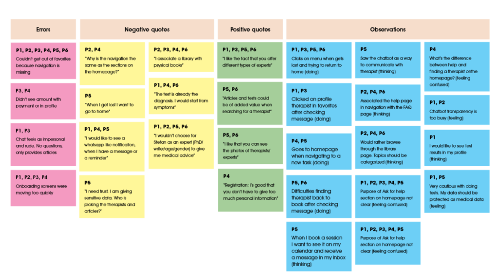
The user testing was very insightful. I spoke with 6 people. All female, in the age from 28-51 years. These sessions were also held remotely, and recorded. A lot of information gave me a deeper understanding of the therapy seeker as a user, which I in turn also used to give my personas more depth.
Regarding the I drew the following conclusions from the testing:
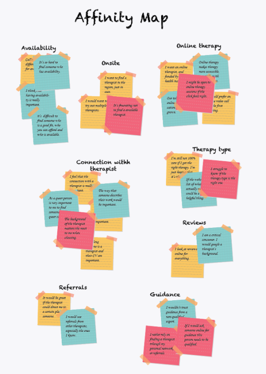
- Most respondents didn’t understand the purpose of the help section on the homepage. In the navigation they associated Help with a FAQ page.
- From three participants I understood that they would never use a chatbot in a web app like this, People want to exchange personal information, the wish to speak to another human being is something that they want to sacrifice 24/7 availability with automatically generated messages for.
- Since the sections on the homepage corresponded with the navigation, many users found them obsolete.
- The bottom navigation felt confusing, and mostly overlooked. Participants would navigate back to the homepage with a new task.
- A lot of the concerns regarded data privacy. Therefore, I felt that the app should be as open as possible, without forcing users to give their data.
- Feeling that the expert should be experienced.
Affinity map
Iterations based on the user testing
Bottom navigation
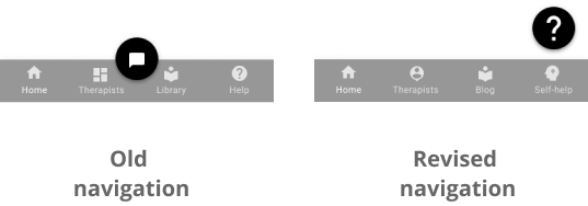
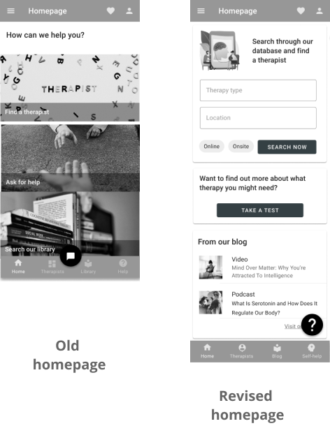
- I decided to change the icon of the chatbot to a help sign, so that it can encompass more than only messaging.
- I changed the icon for the therapist listings to a person, which also humanizes this section.
- As the help icon in the bottom navigation was associated with a FAQ page. So, I decided to change both the name and the icon to the Self-Help section.
Chatbot
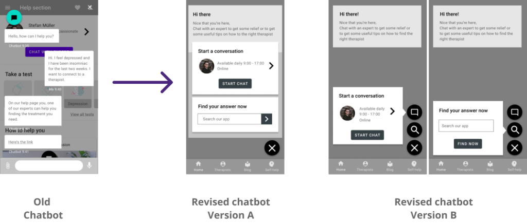
- The chatbot was changed to the “chat with an expert” feature, which is also in the help section. I decided to added a feature to search through the entire app. This turns this feature into a help section instead of a robotized passive chat.
- Since the chatbot had two functions, I could also divide them into two sections connected to a CTA button. I put both versions up for A/B testing, of which version B was chosen with an overwhelming 100%.
Visual Design Principles
Homepage
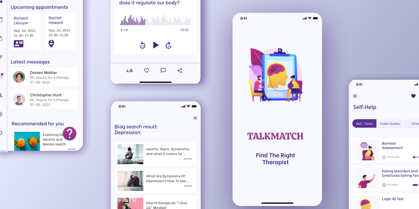
I decided to customize the homepage. Users can immediately start searching for a therapist or take a general test to find out what type of therapy they need.
This also aligns with the needs of both personas Valerie and Ben. In addition, the latest blog content will be shown at the bottom of the page, which adds some dynamic to the homepage.
Blog page
For the blog page I used the Gestalt principle of continuation, which can be seen in the video section, where the slider indicates multiple videos.
I also used the law of similarity a few times in the design by grouping similar content block together to distinguish them from another. Filters are grouped together at the bottom, so that they are received as a group. Also all cards are a good example of the law of similarity. By just looking at their form the user can tell the articles apart from the videos.
Accessibility
Blog search
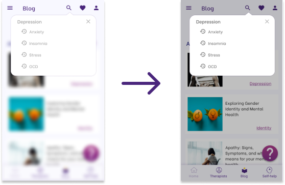
When the search is opened and a dialogue box appears, I first thought to blur the background. However, later on I felt that it was too distracting. So instead, I decided to add a dark overlay, which makes the box stand out more. I also used a darker grey tone to make the text better readable.
Fill in text fields
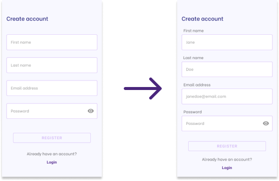
Since the text disappears as soon as the user starts typing, I decided to add a label above the text field boxes. Additionally, I used a darker grey tone for the text to make it more readable.
Text size and icon display
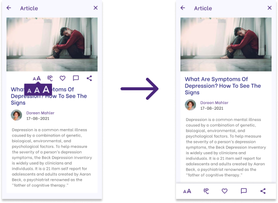
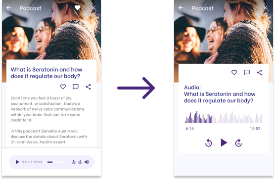
Since this is a web app for people of all walks of life and all age categories, all the content needs to be accessible for everyone. Therefore, I decided to add a feature to increase the font-size for the visually impaired. And I moved the icons to the bottom to make them easier accessible.
Design Language System
Typography
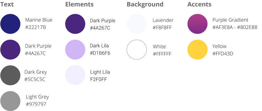
I chose for Lavender as the leading background color throughout as it soothes and brings tranquility. And especially for people with a heavy mental load, it’s important that the site shows them peace and assurance that they will be understood. This is combined with white.
Header text and main elements are in purple add color and playfulness.
Typography
As said before, the site will primarily consists of a lot of text, in the form of blog articles, filters, descriptions etc., reading long texts should be facilitated.
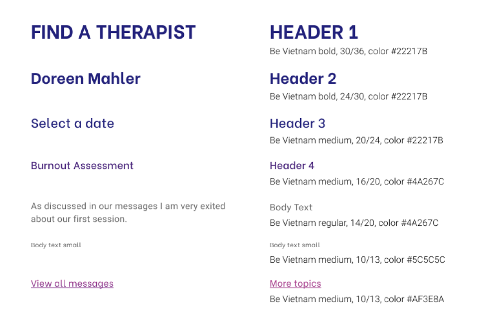
I choose for a round and friendly typeface, which will give the site an open and inviting and look. It also has just enough spacing to group words together and therefore makes it easier to read through long pieces of text online.
H1 should always be written in caps lock, and the other headers should be bold or semi-bold.
Imagery
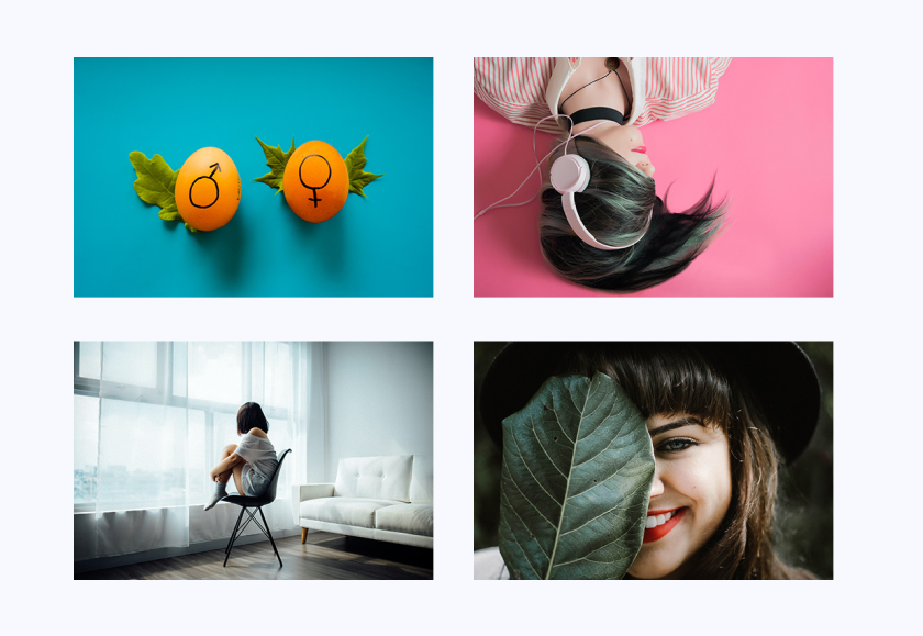
Since this app is more content oriented, I decided to let the visuals do the work. This also humanizes the app, which is an argument that I heard a lot from users, as a way to build trust.
- As much as possible imagery containing people should be used to increase recognizability and to humanize the app.
- The colors should be bright and intense to stand out against the pastel background.
- Subject can vary, but should be related to the field of therapy or human conditions.
Illustrations
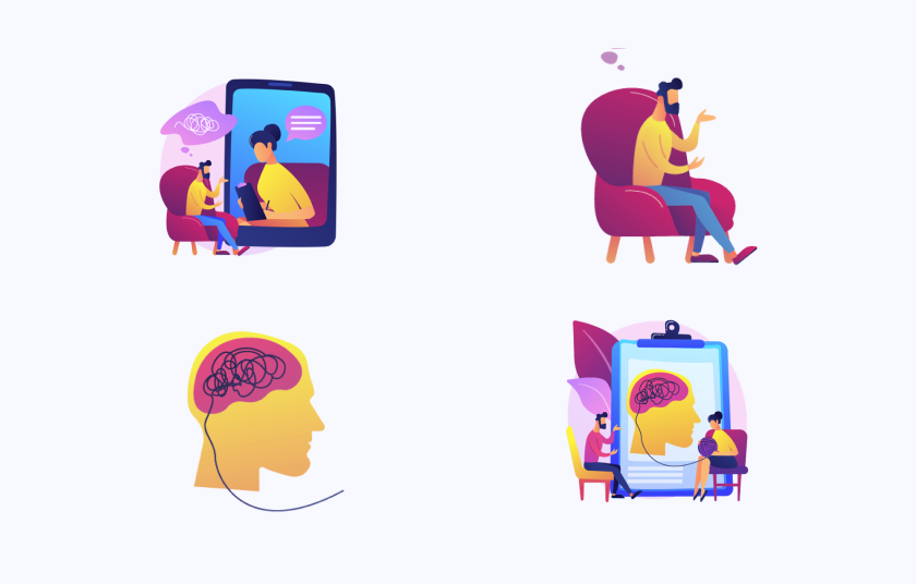
To give the app a light feeling, the illustrations add color and playfulness in places that don’t have imagery.
- Only commissioned illustrations in a similar style can be used in the web app.
- Parts of the illustrations can be used separately, but they shouldn’t be modified or cropped.
- The color palette of the illustrations should be maintained at all times.
UI elements
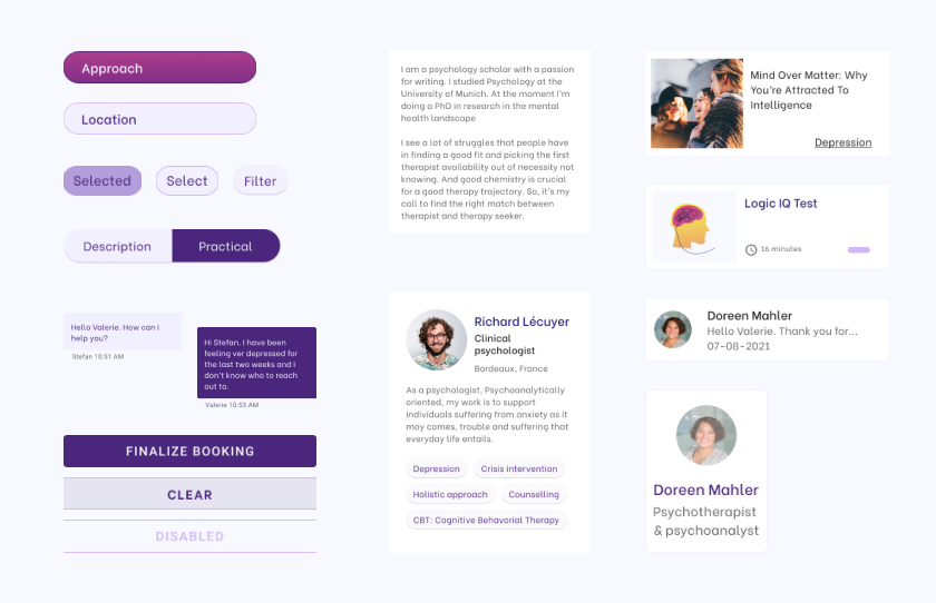
I aimed to apply the open and friendly style to the elements by using round edges.
All content boxes have a white background for better readability.
The text boxes have a padding of 20 px.
Responsive design
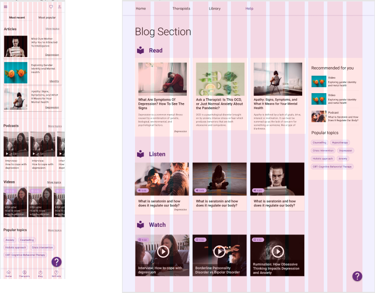
The app uses a 12-column grid layout on both desktop and mobile.
On the desktop the distribution of the elements can vary, depending on the content, as some pages have two side columns and other two.
Final Design
Final Thoughts
Working on this app has been an interesting trajectory. My initial idea revolved around the idea that people could ask questions about there condition on a forum with experts and that they could book trial sessions before making a final choice on a therapy trajectory.
What foremost came out of my research is that people want privacy in their search, and that expertise, also with help in choosing a therapist, is important. My basic idea for the forum therefore had to be abandoned. Also, on the expert side there was reluctance to my idea, as they’re at already full capacity and have no interest in helping people on a forum. In addition, their onboarding process with new clients works for them.
However, the issue of limited availability and therefore choosing for the first therapist available, still remained. Also education on the options within therapy plays a big role. Therefore, I decided to introduce a library, which is linked to all areas in the app. In addition, through testing I found out that the humanization aspect within this app is very important. Therapy is a very vulnerable topic, so people would rather communicate with people, and more so experts in the field. So, I adjusted this accordingly.
What I found the most challenging in my research is finding a representative test- and research group. And I wished that my sample group had been a bit bigger. I reached out to a lot of people in my wider network, but received little response, which I assume is due to the stigma around therapy. Eventually I found some very interesting participants in my personal network, who were also more open, which was due to us knowing each other.

