Project Duration: May – October 2018
Role: UI Designer
Tools used: Figma
Problem Analysis
I was approached by the owner of Bookerator to have a look at the current structure of his website and come with a more intuitive structure and style.
Competitor Analysis
For the competitor analysis I studied the website of Rentals United, which has a similar business model: managing property rentals from one location. I also had a closer look at how users navigate through websites such as Booking.com and AirBnB to study their onboarding flow. Their onboarding process for new rentals was particularly of interest for my flow.
Information Architecture
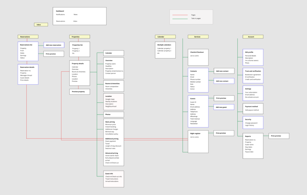
Based on my research I created a new sitemap
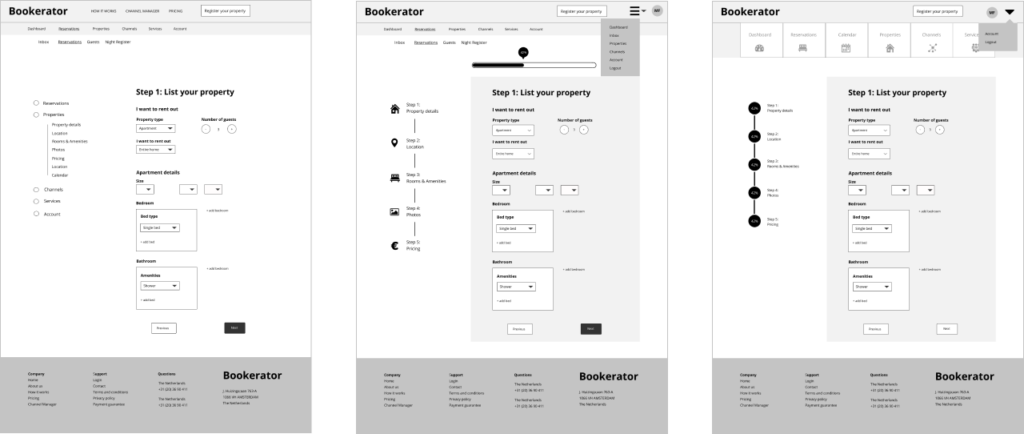
Phase 1: wireframes
I redesigned the dashboard environment. Below is the evolving of the onboarding process in terms of design structure. Here I particularly zoom in on the registration page of the property.
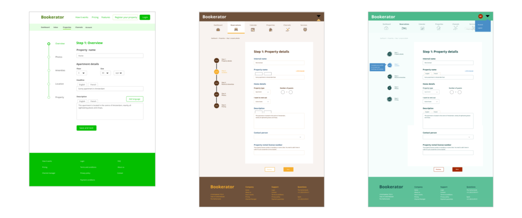
Phase 2: Choosing the style
I started out with a two color system and tried out styles varying from fresh and green to classical and brown.
Eventually, we decided on a business casual system with a light background and blue to portray reliability.
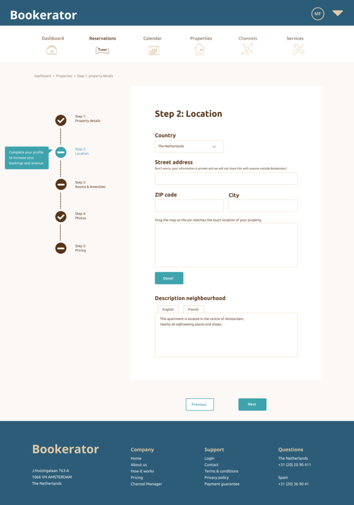
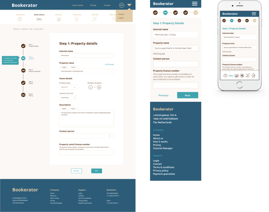
The client also wanted an incentive to make the user finish the onboarding process.
My tryouts evolved from a normal vertical progress bar, to a percentage indicating the amount of information filled in. Eventually we decided to have an incentive box and color code.

The final design
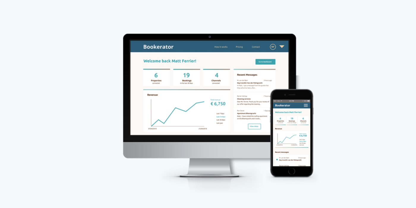
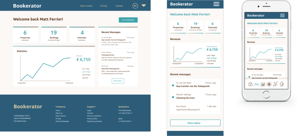
Dashboard
Onboarding page
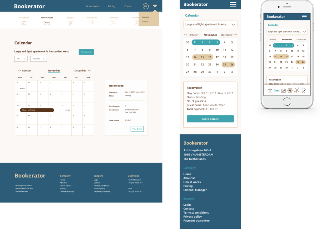
Calendar
